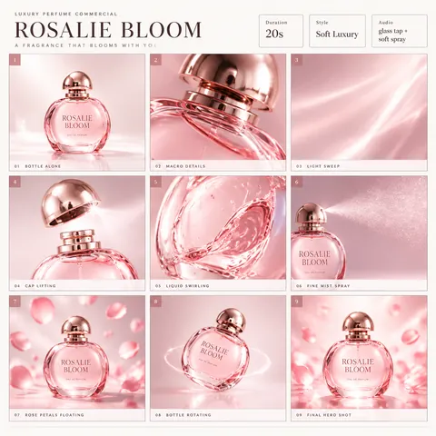
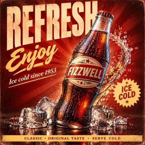
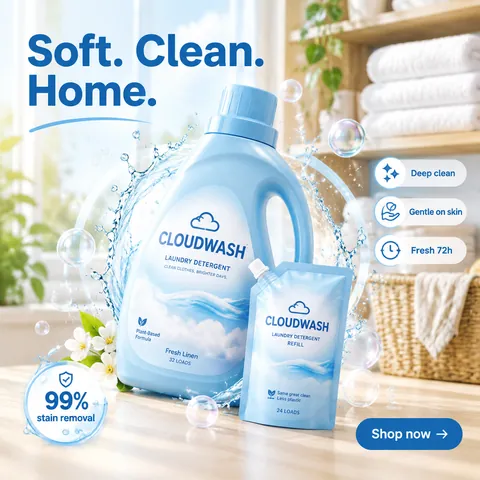
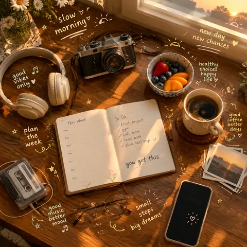
Create a 9:16 editorial food poster using the following inputs:

Brand: {brand name}
Product: {food or drink}
Poster theme: {launch / brunch / seasonal special / promotion / brand campaign}
Headline: {main headline}
Supporting text: {product name / price / time / short description}
Background color: {cream / butter yellow / pale blue / soft pink / etc.}
Accent color: {one main accent color}
Layout direction: {oversized side type / centered editorial / modular grid / repeated typography}

Build the poster around realistic, appetizing food photography combined with bold editorial typography.

Use one clear hero food or drink as the main photographic subject. Preserve realistic textures, natural highlights, shadows, crumbs, cream, glaze, bread structure, fruit surfaces, glass reflections, or other material details appropriate to the product. Avoid CGI, plastic-looking food, excessive retouching, or generic e-commerce photography.

Typography should actively shape the composition rather than simply sit above or below the product. Use oversized display type, cropped letters, vertical text, repeated words, outlined typography, or text extending beyond the canvas. Allow parts of the food to overlap, cover, or break through the typography so the photography and graphic design feel integrated.

Create a lively asymmetric editorial layout with a clear hierarchy:
large headline or display type,
hero food photography,
product or campaign information,
price / time / date if relevant,
and a few small supporting details.

Keep the information meaningful and relatively compact. Do not fill the poster with Lorem Ipsum or random placeholder text.

Use a restrained color system: a light neutral or softly colored background, the natural colors of the food, and one dominant brand accent color. Add only a few supporting graphic elements such as thin lines, small circles, open frames, simple blocks, or subtle organic shapes.

The final result should feel like a professionally art-directed café, bakery, dessert, brunch, or food brand campaign: bold, playful, editorial, appetizing, clean, and visually active. (prompt shared in the author's reply to the post)
为虚构烘焙店"BUTTER & BLOOM"制作编辑风美食海报。产品:叠着香蕉片、淋着亮泽焦糖的焦糖华夫饼。海报主题:周末早午餐新品。标题"Sunday tastes golden",辅助文字"Caramel Waffle · $9 · Sat–Sun 9–14"。黄油黄背景,一种主导的焦糖棕点缀色。版式方向:超大竖排侧边字——单词"WAFFLE"沿左侧边缘竖向巨大排列,被画布裁切,华夫饼叠压并突破字母。写实诱人的质感、碎屑与糖浆高光,少量细线与小圆,层级生动且不对称,俏皮又专业,文字清晰,无真实品牌。1:1方形构图。
為虛構烘焙店"BUTTER & BLOOM"製作編輯風美食海報。產品:疊著香蕉片、淋著亮澤焦糖的焦糖華夫餅。海報主題:週末早午餐新品。標題"Sunday tastes golden",輔助文字"Caramel Waffle · $9 · Sat–Sun 9–14"。黃油黃背景,一種主導的焦糖棕點綴色。版式方向:超大豎排側邊字——單詞"WAFFLE"沿左側邊緣豎向巨大排列,被畫布裁切,華夫餅疊壓並突破字母。寫實誘人的質感、碎屑與糖漿高光,少量細線與小圓,層級生動且不對稱,俏皮又專業,文字清晰,無真實品牌。1:1方形構圖。
أنشئ ملصق طعام تحريري بنسبة 9:16 باستخدام المدخلات التالية:

العلامة التجارية: {اسم العلامة التجارية}
المنتج: {طعام أو شراب}
موضوع الملصق: {إطلاق / برانش / عرض موسمي / ترويج / حملة علامة تجارية}
العنوان الرئيسي: {العنوان الرئيسي}
النص الداعم: {اسم المنتج / السعر / الوقت / وصف قصير}
لون الخلفية: {كريمي / أصفر زبدي / أزرق باهت / وردي ناعم / إلخ}
لون التمييز: {لون تمييز رئيسي واحد}
اتجاه التصميم: {نص جانبي مفرط الحجم / تحريري متمركز / شبكة معيارية / طباعة متكررة}

ابنِ الملصق حول تصوير طعام واقعي وشهي مدمج مع طباعة تحريرية جريئة.

استخدم عنصر طعام أو شراب بطولي واحد واضح كموضوع تصويري رئيسي. حافظ على الملمس الواقعي، والإبرازات الطبيعية، والظلال، والفتات، والكريمة، والطلاء، وبنية الخبز، وأسطح الفاكهة، وانعكاسات الزجاج، أو تفاصيل المواد الأخرى المناسبة للمنتج. تجنب الصور المولدة بالحاسوب، أو الطعام الذي يبدو بلاستيكيًا، أو التنقيح المفرط، أو تصوير التجارة الإلكترونية العام.

يجب أن تشكّل الطباعة التكوين بفعالية بدلًا من أن تكتفي بالجلوس فوق المنتج أو تحته. استخدم خطوط العرض المفرطة الحجم، والحروف المقصوصة، والنص العمودي
Crea un poster editoriale gastronomico in formato 9:16 utilizzando i seguenti input:
Brand: {nome del marchio}
Prodotto: {cibo o bevanda}
Tema del poster: {lancio / brunch / specialità stagionale / promozione / campagna di marca}
Titolo principale: {titolo principale}
Testo di supporto: {nome del prodotto / prezzo / orario / breve descrizione}
Colore di sfondo: {crema / giallo burro / azzurro pallido / rosa tenue / ecc.}
Colore d'accento: {un colore d'accento principale}
Direzione del layout: {tipografia laterale sovradimensionata / editoriale centrato / griglia modulare / tipografia ripetuta}
Costruisci il poster attorno a una fotografia gastronomica realistica e appetitosa combinata con una tipografia editoriale audace.
Usa un chiaro soggetto fotografico principale: un cibo o una bevanda. Preserva texture realistiche, riflessi naturali, ombre, briciole, crema, glassa, struttura del pane, superfici della frutta, riflessi del vetro o altri dettagli materiali appropriati al prodotto. Evita CGI, cibo dall'aspetto plastico, ritocchi eccessivi o fotografia e-commerce generica.
La tipografia dovrebbe plasmare attivamente la composizione invece di limitarsi a stare sopra o sotto il prodotto. Usa caratteri display sovradimensionati, lettere ritagliate, testo verticaleErstelle ein redaktionelles Food-Poster im 9:16-Format mit den folgenden Eingaben:
Marke: {Markenname}
Produkt: {Lebensmittel oder Getränk}
Poster-Thema: {Launch / Brunch / Saison-Special / Promotion / Markenkampagne}
Überschrift: {Hauptüberschrift}
Begleittext: {Produktname / Preis / Uhrzeit / Kurzbeschreibung}
Hintergrundfarbe: {Creme / Buttergelb / Hellblau / Zartrosa / usw.}
Akzentfarbe: {eine Hauptakzentfarbe}
Layout-Richtung: {überdimensionierte Seitentypografie / zentriertes Editorial / modulares Raster / wiederholte Typografie}
Gestalte das Poster um realistische, appetitliche Food-Fotografie herum, kombiniert mit kühner redaktioneller Typografie.
Verwende ein klares Hero-Lebensmittel oder -Getränk als Hauptmotiv der Fotografie. Bewahre realistische Texturen, natürliche Glanzlichter, Schatten, Krümel, Creme, Glasur, Brotstruktur, Fruchtoberflächen, Glasreflexionen oder andere materialgerechte Details des Produkts. Vermeide CGI, plastikartig wirkende Lebensmittel, übermäßige Retusche oder generische E-Commerce-Fotografie.
Die Typografie sollte die Komposition aktiv mitgestalten, statt einfach über oder unter dem Produkt zu stehen. Verwende überdimensionierte Display-Schrift, angeschnittene Buchstaben, vertikalen TextCrea un póster editorial de comida en formato 9:16 utilizando los siguientes datos:
Marca: {nombre de la marca}
Producto: {comida o bebida}
Tema del póster: {lanzamiento / brunch / especial de temporada / promoción / campaña de marca}
Titular: {titular principal}
Texto de apoyo: {nombre del producto / precio / hora / descripción breve}
Color de fondo: {crema / amarillo mantequilla / azul pálido / rosa suave / etc.}
Color de acento: {un color de acento principal}
Dirección del diseño: {tipografía lateral sobredimensionada / editorial centrado / cuadrícula modular / tipografía repetida}
Construye el póster en torno a una fotografía de comida realista y apetitosa combinada con una tipografía editorial audaz.
Utiliza una comida o bebida protagonista clara como sujeto fotográfico principal. Preserva texturas realistas, brillos naturales, sombras, migas, crema, glaseado, estructura del pan, superficies de fruta, reflejos en el vidrio u otros detalles matéricos apropiados para el producto. Evita CGI, comida con aspecto plástico, retoques excesivos o fotografía de comercio electrónico genérica.
La tipografía debe moldear activamente la composición en lugar de limitarse a situarse encima o debajo del producto. Utiliza tipografía display sobredimensionada, letras recortadas, texto vertical以下の入力を使って9:16のエディトリアル・フードポスターを作成してください:
ブランド:{ブランド名}
商品:{食品または飲料}
ポスターテーマ:{ローンチ / ブランチ / 季節限定 / プロモーション / ブランドキャンペーン}
見出し:{メイン見出し}
補足テキスト:{商品名 / 価格 / 時間 / 短い説明}
背景色:{クリーム / バターイエロー / ペールブルー / ソフトピンク / など}
アクセントカラー:{メインのアクセントカラー1色}
レイアウトの方向性:{特大のサイドタイポグラフィ / 中央揃えエディトリアル / モジュラーレイアウト / 繰り返しタイポグラフィ}
リアルで食欲をそそるフード写真と大胆なエディトリアルタイポグラフィを組み合わせてポスターを構築してください。
明確なヒーローとなる食品または飲料を写真のメイン被写体としてください。リアルな質感、自然なハイライト、影、パンくず、クリーム、グレーズ、パンの構造、果物の表面、グラスの反射など、商品に適した素材のディテールを保ってください。CGI、プラスチックのように見える食品、過度なレタッチ、ありきたりなEコマース写真は避けてください。
タイポグラフィは商品の上や下に単に配置されるのではなく、構図を積極的に形作るべきです。特大のディスプレイ書体、切り取られた文字、縦書きテキストを使用してくださいAşağıdaki girdileri kullanarak 9:16 formatında editoryal bir yemek posteri oluşturun:
Marka: {marka adı}
Ürün: {yiyecek veya içecek}
Poster teması: {lansman / brunch / sezonluk özel / promosyon / marka kampanyası}
Başlık: {ana başlık}
Destek metni: {ürün adı / fiyat / saat / kısa açıklama}
Arka plan rengi: {krem / tereyağı sarısı / soluk mavi / yumuşak pembe / vb.}
Vurgu rengi: {bir ana vurgu rengi}
Mizanpaj yönü: {büyük boy yan tipografi / ortalanmış editoryal / modüler ızgara / tekrarlanan tipografi}
Posteri gerçekçi, iştah açıcı yemek fotoğrafçılığı ile cesur editoryal tipografiyi birleştirerek oluşturun.
Ana fotoğrafik özne olarak net bir kahraman yiyecek veya içecek kullanın. Gerçekçi dokuları, doğal parlamaları, gölgeleri, kırıntıları, kremayı, parlak sosları, ekmek yapısını, meyve yüzeylerini, cam yansımalarını veya ürüne uygun diğer malzeme detaylarını koruyun. CGI, plastik görünümlü yiyecekler, aşırı rötuş veya genel e-ticaret fotoğrafçılığından kaçının.
Tipografi, ürünün yalnızca üstüne veya altına yerleşmek yerine kompozisyonu aktif olarak şekillendirmelidir. Büyük boy display yazı tipi, kırpılmış harfler, dikey metin kullanınTạo một poster biên tập về ẩm thực với tỷ lệ 9:16 bằng các thông tin đầu vào sau:
Thương hiệu: {tên thương hiệu}
Sản phẩm: {món ăn hoặc đồ uống}
Chủ đề poster: {ra mắt / brunch / đặc biệt theo mùa / khuyến mãi / chiến dịch thương hiệu}
Tiêu đề: {tiêu đề chính}
Văn bản hỗ trợ: {tên sản phẩm / giá / thời gian / mô tả ngắn}
Màu nền: {kem / vàng bơ / xanh nhạt / hồng nhạt / v.v.}
Màu nhấn: {một màu nhấn chính}
Hướng bố cục: {chữ kiểu bên cạnh cỡ lớn / biên tập căn giữa / lưới mô-đun / chữ lặp lại}
Xây dựng poster xoay quanh hình ảnh ẩm thực chân thực, hấp dẫn kết hợp với kiểu chữ biên tập đậm nét.
Sử dụng một món ăn hoặc đồ uống chủ đạo rõ ràng làm chủ thể chính trong ảnh. Giữ nguyên kết cấu chân thực, điểm sáng tự nhiên, bóng đổ, vụn bánh, kem, lớp phủ bóng, cấu trúc bánh mì, bề mặt trái cây, phản chiếu trên ly hoặc các chi tiết vật liệu khác phù hợp với sản phẩm. Tránh CGI, món ăn trông như nhựa, chỉnh sửa quá mức hoặc ảnh thương mại điện tử chung chung.
Kiểu chữ nên chủ động định hình bố cục thay vì chỉ đặt phía trên hoặc phía dưới sản phẩm. Sử dụng chữ hiển thị cỡ lớn, chữ bị cắt xén, chữ dọcEditorial food poster for a fictional bakery "BUTTER & BLOOM". Product: a caramel waffle stacked with banana slices and a glossy caramel drizzle. Poster theme: weekend brunch launch. Headline "Sunday tastes golden", supporting text "Caramel Waffle · $9 · Sat–Sun 9–14". Butter-yellow background, one dominant caramel-brown accent. Layout direction: oversized vertical side type — the word "WAFFLE" runs huge and vertical along the left edge, cropped by the canvas, with the waffle overlapping and breaking through the letters. Realistic appetizing textures, crumbs and glaze highlights, a few thin lines and small circles, lively asymmetric hierarchy, playful but professional, crisp readable text, no real brands. Square 1:1 composition.
- Set square 1:1; filled template variables with fictional names; replaced real brand names with fictional ones and removed any uploaded-logo, uploaded-product or reference-photo requirement
cinel 为生成示例图做了以上替换。