English 中文 繁體 العربية Italiano Deutsch Español 日本語 Türkçe Tiếng Việt
Version used for this image Create a 9:16 editorial food poster based on the following inputs:
Brand: {brand name}
Food / Drink: {main product}
Headline: {main campaign line}
Supporting text: {product name / ingredients / price / opening hours}
Background color: {light neutral or soft brand color}
Accent colors: {1–2 restrained accent colors}
Typography word: {one short word related to the product}
Composition direction: {vertical / diagonal / circular / crossed / horizontal}
Build the entire poster around the natural shape and direction of the food itself.
Use one clear hero product with highly realistic food photography: appetizing textures, natural highlights, shadows, moisture, crumbs, glaze, melted cheese, glass reflections, fresh ingredients, or other details appropriate to the product. Avoid CGI, plastic textures, excessive retouching, or generic e-commerce photography.
Let the product shape determine how the layout moves. A tall drink can drive a vertical composition, a pizza slice can create a strong diagonal, a round bowl can guide circular typography, and crossed products can form an X-shaped structure.
Use oversized editorial typography as an active part of the composition. The main word should be very large, cropped by the canvas, partially hidden behind the food, split across different areas, rotated, curved, or extended beyond the frame according to the product geometry.
The food and typography must overlap and interact. Do not simply place text beside the product. Let the product cover parts of letters, cross typographic boundaries, break through color blocks, or interrupt the grid so photography and graphic design feel integrated.
Use a clear hierarchy:
oversized display typography,
hero food photography,
main headline,
product information,
price / time / short supporting details.
Keep all supporting copy meaningful and concise. Do not use Lorem Ipsum or random filler text.
Use a restrained color system with a light background, realistic food colors, and 1–2 brand accents. Add only a few graphic elements such as thin lines, dots, open frames, geometric blocks, soft organic shapes, or small information labels.
The composition should feel energetic and asymmetric while still carefully art-directed, with enough negative space to keep the poster readable.
Final style: modern food editorial design, bold typography, dynamic composition, photorealistic food photography, retro-modern branding, clean spacing, playful but professional. (prompt shared in the author's reply to the post) 为虚构披萨店"SLICE CLUB"制作编辑风食物海报。主角产品:一块热蜂蜜意式辣香肠披萨,高度写实的美食摄影,芝士拉丝、亮泽的蜂蜜淋酱和焦脆饼边。让披萨的形状决定版式:强烈的对角线构图。超大单词"HOT"沿同一对角线旋转、被画布裁切,并被披萨部分遮挡,让摄影与文字咬合在一起。层级清晰:展示大字、主角披萨、标题"Sweet heat, every slice"、小号信息"Hot Honey Pepperoni · $5 · Open till late"。浅奶油色背景,真实食物色彩,番茄红与蜂蜜金点缀,少量细线与小圆点。充满活力的不对称版式,复古现代品牌感,留白干净,文字清晰,无真实品牌。1:1方形构图。 為虛構披薩店"SLICE CLUB"製作編輯風食物海報。主角產品:一塊熱蜂蜜意式辣香腸披薩,高度寫實的美食攝影,芝士拉絲、亮澤的蜂蜜淋醬和焦脆餅邊。讓披薩的形狀決定版式:強烈的對角線構圖。超大單詞"HOT"沿同一對角線旋轉、被畫布裁切,並被披薩部分遮擋,讓攝影與文字咬合在一起。層級清晰:展示大字、主角披薩、標題"Sweet heat, every slice"、小號資訊"Hot Honey Pepperoni · $5 · Open till late"。淺奶油色背景,真實食物色彩,番茄紅與蜂蜜金點綴,少量細線與小圓點。充滿活力的不對稱版式,復古現代品牌感,留白乾淨,文字清晰,無真實品牌。1:1方形構圖。 أنشئ ملصق طعام تحريري بنسبة 9:16 بناءً على المدخلات التالية:
العلامة التجارية: {brand name}
الطعام / الشراب: {main product}
العنوان الرئيسي: {main campaign line}
النص الداعم: {product name / ingredients / price / opening hours}
لون الخلفية: {light neutral or soft brand color}
ألوان التمييز: {1–2 restrained accent colors}
كلمة الطباعة: {one short word related to the product}
اتجاه التكوين: {vertical / diagonal / circular / crossed / horizontal}
ابنِ الملصق بأكمله حول الشكل الطبيعي والاتجاه للطعام نفسه.
استخدم منتجًا واحدًا واضحًا كبطل مع تصوير طعام واقعي للغاية: ملمس شهي، إبرازات طبيعية، ظلال، رطوبة، فتات، طبقة لامعة، جبن ذائب، انعكاسات زجاجية، مكونات طازجة، أو تفاصيل أخرى مناسبة للمنتج. تجنب الصور المولدة بالحاسوب، أو الملمس البلاستيكي، أو التنقيح المفرط، أو تصوير التجارة الإلكترونية العام.
دع شكل المنتج يحدد كيفية تحرك التخطيط. يمكن لمشروب طويل أن يقود تكوينًا عموديًا، وشريحة بيتزا يمكن أن تخلق قطرًا قويًا، ووعاء دائري يمكن أن يوجه الطباعة الدائرية، والمنتجات المتقاطعة يمكن أن تشكل هيكلًا على شكل X. Crea un poster editoriale gastronomico in formato 9:16 basato sui seguenti input:
Marchio: {brand name}
Cibo / Bevanda: {main product}
Titolo: {main campaign line}
Testo di supporto: {product name / ingredients / price / opening hours}
Colore di sfondo: {light neutral or soft brand color}
Colori d'accento: {1–2 restrained accent colors}
Parola tipografica: {one short word related to the product}
Direzione della composizione: {vertical / diagonal / circular / crossed / horizontal}
Costruisci l'intero poster attorno alla forma e alla direzione naturale del cibo stesso.
Usa un chiaro prodotto protagonista con fotografia gastronomica altamente realistica: texture appetitose, riflessi naturali, ombre, umidità, briciole, glassa, formaggio fuso, riflessi sul vetro, ingredienti freschi o altri dettagli appropriati al prodotto. Evita CGI, texture plastiche, ritocchi eccessivi o fotografia generica da e-commerce.
Lascia che la forma del prodotto determini il movimento del layout. Una bevanda alta può guidare una composizione verticale, una fetta di pizza può creare una forte diagonale, una ciotola rotonda può guidare una tipografia circolare e prodotti incrociati possono formare una struttura a X. Erstelle ein redaktionelles Food-Poster im 9:16-Format basierend auf den folgenden Eingaben:
Marke: {brand name}
Essen / Getränk: {main product}
Überschrift: {main campaign line}
Begleittext: {product name / ingredients / price / opening hours}
Hintergrundfarbe: {light neutral or soft brand color}
Akzentfarben: {1–2 restrained accent colors}
Typografie-Wort: {one short word related to the product}
Kompositionsrichtung: {vertical / diagonal / circular / crossed / horizontal}
Baue das gesamte Poster um die natürliche Form und Richtung des Essens selbst herum auf.
Verwende ein klares Heldenprodukt mit highly realistic food photography: appetitliche Texturen, natürliche Highlights, Schatten, Feuchtigkeit, Krümel, Glasur, geschmolzener Käse, Glasreflexionen, frische Zutaten oder andere Details, die für das Produkt geeignet sind. Vermeide CGI, plastische Texturen, übermäßige Retusche oder generische E-Commerce-Fotografie.
Lass die Produktform bestimmen, wie sich das Layout bewegt. Ein hohes Getränk kann eine vertikale Komposition antreiben, ein Pizzastück kann eine starke Diagonale erzeugen, eine runde Schüssel kann eine kreisförmige Typografie führen, und gekreuzte Produkte können eine X-förmige Struktur bilden. Crea un póster editorial de comida en formato 9:16 basado en los siguientes inputs:
Marca: {brand name}
Comida / Bebida: {main product}
Titular: {main campaign line}
Texto de apoyo: {product name / ingredients / price / opening hours}
Color de fondo: {light neutral or soft brand color}
Colores de acento: {1–2 restrained accent colors}
Palabra tipográfica: {one short word related to the product}
Dirección de composición: {vertical / diagonal / circular / crossed / horizontal}
Construye todo el póster alrededor de la forma y dirección natural de la comida misma.
Usa un producto protagonista claro con fotografía gastronómica altamente realista: texturas apetitosas, reflejos naturales, sombras, humedad, migas, glaseado, queso derretido, reflejos en el vaso, ingredientes frescos u otros detalles apropiados para el producto. Evita CGI, texturas plásticas, retoques excesivos o fotografía genérica de comercio electrónico.
Deja que la forma del producto determine cómo se mueve el diseño. Una bebida alta puede impulsar una composición vertical, una porción de pizza puede crear una fuerte diagonal, un tazón redondo puede guiar una tipografía circular y los productos cruzados pueden formar una estructura en forma de X. 以下の入力に基づいて、9:16の編集用フードポスターを作成してください:
ブランド:{brand name}
食べ物 / 飲み物:{main product}
見出し:{main campaign line}
補足テキスト:{product name / ingredients / price / opening hours}
背景色:{light neutral or soft brand color}
アクセントカラー:{1–2 restrained accent colors}
タイポグラフィワード:{one short word related to the product}
構図の方向:{vertical / diagonal / circular / crossed / horizontal}
食べ物自体の自然な形と方向を中心にポスター全体を構築してください。
明確なヒーロー製品を使用し、非常にリアルなフード写真を使用してください:食欲をそそる質感、自然なハイライト、影、湿気、パン粉、グレーズ、溶けたチーズ、グラスの反射、新鮮な食材、その他製品に適した詳細。CGI、プラスチックのような質感、過度なレタッチ、一般的なEコマース写真は避けてください。
製品の形状がレイアウトの動きを決定するようにしてください。背の高い飲み物は垂直構図を導き、ピザのスライスは強い対角線を作り、丸いボウルは円形のタイポグラフィを導き、交差した製品はX字型の構造を形成できます。 Aşağıdaki girdilere dayalı olarak 9:16 formatında editoryal bir yemek posteri oluşturun:
Marka: {brand name}
Yemek / İçecek: {main product}
Başlık: {main campaign line}
Destekleyici metin: {product name / ingredients / price / opening hours}
Arka plan rengi: {light neutral or soft brand color}
Vurgu renkleri: {1–2 restrained accent colors}
Tipografi kelimesi: {one short word related to the product}
Kompozisyon yönü: {vertical / diagonal / circular / crossed / horizontal}
Tüm posteri yemeğin kendi doğal şekli ve yönü etrafında oluşturun.
Net bir ana ürün kullanın ve son derece gerçekçi yemek fotoğrafçılığı kullanın: iştah açıcı dokular, doğal vurgular, gölgeler, nem, kırıntılar, parlaklık, erimiş peynir, cam yansımaları, taze malzemeler veya ürüne uygun diğer detaylar. CGI, plastik dokular, aşırı rötuş veya genel e-ticaret fotoğrafçılığından kaçının.
Ürün şeklinin düzenin nasıl hareket edeceğini belirlemesine izin verin. Uzun bir içecek dikey bir kompozisyonu yönlendirebilir, bir pizza dilimi güçlü bir diyagonal oluşturabilir, yuvarlak bir kase dairesel tipografiyi yönlendirebilir ve çapraz ürünler X şeklinde bir yapı oluşturabilir. Tạo một poster ẩm thực biên tập tỷ lệ 9:16 dựa trên các thông tin đầu vào sau:
Thương hiệu: {brand name}
Đồ ăn / Đồ uống: {main product}
Tiêu đề: {main campaign line}
Văn bản hỗ trợ: {product name / ingredients / price / opening hours}
Màu nền: {light neutral or soft brand color}
Màu nhấn: {1–2 restrained accent colors}
Từ typography: {one short word related to the product}
Hướng bố cục: {vertical / diagonal / circular / crossed / horizontal}
Xây dựng toàn bộ poster xoay quanh hình dạng và hướng tự nhiên của chính món ăn.
Sử dụng một sản phẩm chính rõ ràng với hình ảnh ẩm thực chân thực cao: kết cấu hấp dẫn, điểm sáng tự nhiên, bóng đổ, độ ẩm, vụn bánh, lớp men, phô mai tan chảy, phản chiếu trên ly, nguyên liệu tươi hoặc các chi tiết khác phù hợp với sản phẩm. Tránh CGI, kết cấu nhựa, chỉnh sửa quá mức hoặc nhiếp ảnh thương mại điện tử thông thường.
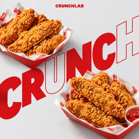
Để hình dạng sản phẩm quyết định cách bố cục di chuyển. Một thức uống cao có thể thúc đẩy bố cục dọc, một lát pizza có thể tạo đường chéo mạnh, một bát tròn có thể dẫn dắt typography tròn, và các sản phẩm bắt chéo có thể tạo thành cấu trúc hình chữ X. Editorial food poster for a fictional pizzeria "SLICE CLUB". Hero product: one hot honey pepperoni pizza slice, highly realistic food photography with melted cheese pull, glossy honey drizzle and crisp charred crust. Let the slice shape drive the layout: a strong diagonal composition. The oversized word "HOT" is very large, rotated along the same diagonal, cropped by the canvas and partly covered by the slice so photography and type interlock. Clear hierarchy: display word, hero slice, headline "Sweet heat, every slice", small info "Hot Honey Pepperoni · $5 · Open till late". Light cream background, realistic food colors, tomato-red and honey-gold accents, a few thin lines and small dots. Energetic asymmetric layout, retro-modern branding, clean spacing, crisp readable text, no real brands. Square 1:1 composition. Set square 1:1; filled template variables with fictional names; replaced real brand names with fictional ones and removed any uploaded-logo, uploaded-product or reference-photo requirement cinel made the replacements above to generate the example image.
Copy
2 credits for members at 1K, 6 with daily credits. Ratio 1:1.