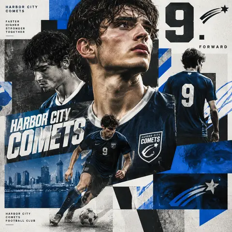
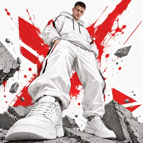
A tactile logo mockup with real street credibility. Instead of printing the logo on a wall, the prompt reveals its silhouette through years of ripped posters: overlapping paper layers with fibrous torn edges, curls, glue residue, fading and stains, a rough plaster wall showing through, and daylight casting small shadows inside each tear. The physics section (humidity curling edges, glue holding some areas) is what makes it convincing. With our reference, a simple black geometric fox-head mark, the result shows the fox emerging from cream paper surrounded by faded red, blue and printed fragments. Great for brand reveals, album art or streetwear campaigns. Simple, bold logos work best.
How to adapt it
Variable
What it changes
Examples
the uploaded logo
your logo (attach as reference)
a bold single-colour mark
Multiple overlapping poster layers
poster colours and prints
faded red and blue gig posters, newsprint and Chinese characters
Urban street setting
location
alley wall, subway underpass
Tips
Bold, simple logos survive the torn-paper treatment best.
Keep the physics lines for believable curling and peeling.