Cinel AI
Prompts
All promptsBrowse the full libraryPortrait & HeadshotProduct & E-commercePosters, Logos & Graphic DesignInfographics & UI3D Characters & FigurinesFood & DrinkIllustration & AnimeCreative Scenes
AI Image
Free AI Image GeneratorCreate images from text promptsText to Image GeneratorCreate images from text promptsAI Image to Image GeneratorGenerate from reference imagesAI Image EditorEdit existing images with textBackground RemoverRemove backgrounds instantlyImage UpscalerUpscale images 2x or 4xAI UncropExpand images beyond their borders
AI Video
AI Video GeneratorOpen the video generation workspaceText to Video GeneratorCreate videos from text promptsImage to VideoAnimate reference images
AI Models

Image models

KolorsFree Kolors image creation with prompt and reference support.Z-Image TurboFast photoreal generation with bilingual text accuracy.Seedream 4.0Cost-efficient 1K, 2K and 4K visuals with multi-reference editing.Seedream 4.54K generation, text rendering and reference editing.Seedream 5.0 LiteCinematic 3K realism with multi-reference creative direction.Seedream 5 Pro1K fast, 1.5K lightweight, or 2K professional visuals with text and references.GPT Image 2Precise prompts, clean text and polished product shots.GPT Image 2.5Faster GPT Image generation with sharper, consistent edits.Nano Banana 2 LiteFast 1K generation and editing for high-volume iteration.Nano Banana 2Multi-reference edits with fast style control.Nano Banana Pro4K renders and advanced image editing.Nano BananaLightweight Gemini edits for quick changes.

Video models

Seedance 1.0 TurboFast video generation with smooth motion, up to 1080p.Seedance 2.54–30 second video with synchronized audio, 480p or 720p.Seedance 2.0 MiniLower-cost 4–15 second video with synchronized audio, 480p or 720p.Seedance 2.04–15 second video with Fast or Standard mode, up to 1080p.MiniMax H3High-fidelity 4–15 second video with image and reference support.Kling 3.0Strong motion, camera moves and optional sound, up to 4K.Kling 3.0 TurboFaster 3–15 second video at 720p or 1080p, with first-frame input.Kling O1Kling O1 image-to-video with first and optional last frame input.Kling O3Kling O3 text-to-video and first/end-frame generation up to 4K.Grok Imagine Video 1.06–30 second beta video with Fun, Normal and Spicy style modes.Grok Imagine Video 1.51–15 second video with native audio and up to 7 image references.Wan 2.55–10 second text or single-image video with native audio.Wan 2.62–15 second multi-shot video with native audio at 720p or 1080p.Wan 2.72–15 second video with text, first/end frames and up to three image references.Veo 3.1 FastStable Fast Veo 3.1 with 4–8 second video, audio and frame input.Veo 3.1 ProStable Pro Veo 3.1 with 4–8 second video, audio and frame input.Veo 3.1 Fast BetaFast Beta 8-second video with first/end-frame or three-image reference input.Veo 3.1 Pro BetaPro Beta fixed 8-second video with first/end-frame input.Sora 24–12 second video with synchronized audio and one optional first-frame image.
Pricing
-50%Upgrade
  1. Prompts
  2. Posters, Logos & Graphic Design
  3. Y2K Harajuku Sticker Badge Logo Prompt

Y2K Harajuku-Style Sticker Badge for Your Brand Name


Act as a Senior Vector Graphic Designer specializing in Y2K Japanese streetwear badge design. Your aesthetic universe: Tokyo Harajuku bootleg culture, early 2000s Japanese brand remixes, retro-futuristic sticker art. The output must look exactly like a clean Adobe Illustrator vector file — flat, graphic, sticker-ready. The visual structure is NOT fixed — it must be invented fresh for each brand based on their identity.

BRAND INTELLIGENCE SYSTEM

Before executing, resolve all of the following and use them to drive every design decision: (1) PRIMARY COLOR — 's main brand color converted into a pastel or softened Y2K version — still recognizable as the brand but lighter and more kawaii, (2) ACCENT COLOR — 's secondary color pushed to warm saturation — the energetic pop color of the composition, (3) DARK COLOR — a deep dark version of the brand palette — navy, dark brown, deep green, near-black — used for all outlines and extrusions, (4) LETTER CONTENT — 's name in bold lowercase or the most iconic abbreviation, (5) JAPANESE TRANSLITERATION — correct katakana of  as a small secondary text element, (6) BRAND ORIGIN FLAG — 's country of origin national flag as a small flat element, (7) BRAND SHAPE LANGUAGE — identify the most iconic geometric or graphic forms from 's visual identity — the shapes, curves, symbols, and structural elements unique to this brand. These shapes become the orbital, background, and decorative elements of the badge — replacing generic ovals with brand-specific geometry, (8)  — identify 1–2 small iconic objects or symbols from 's world that can be rendered as tiny flat illustrations within the badge — not the logo itself but objects associated with the brand's universe, (9) COMPOSITION LOGIC — based on all resolved parameters above, autonomously design the structural layout of the badge. The structure must feel like it was invented specifically for  — not copied from a template. Ask: what shapes from this brand's identity could orbit the letters? What geometry feels native to this brand? How would a Tokyo designer remix this specific brand's visual language into a badge?

PHASE 1: CANVAS

1:1 square canvas. Background: flat off-white or warm light grey. Completely empty. No texture. No gradient.

PHASE 2: BADGE STRUCTURE — FULLY AUTONOMOUS

Using the BRAND SHAPE LANGUAGE and COMPOSITION LOGIC resolved above, design the complete badge structure. The only fixed rules are: the badge must have a central lettering element, surrounding geometric shapes that interact with the letters through z-layer stacking, at least one element that passes both behind and in front of the letters creating depth, and the overall silhouette must read as a unified badge or patch shape. Everything else — the specific shapes, their arrangement, their proportions, how many layers exist, what geometric forms surround the text — is determined by the brand's own visual DNA. The shapes must feel inevitable — as if they could only belong to this brand.

PHASE 3: LETTERING

 in large bold lowercase — wide, rounded, confident display typeface. Flat PRIMARY COLOR fill. Thick flat DARK COLOR extrusion offset down-right at 8–12% of letter height. Bold DARK COLOR outline. No gradients. No rendering. The letters are the anchor of the entire composition.

PHASE 4: Y2K SIGNATURE ELEMENTS

These elements appear in every execution — they are the Y2K Japanese badge DNA: SPEED LINES or MOTION TEXTURE — somewhere within the background shapes, parallel lines or radial lines in ACCENT COLOR creating energy and movement. 4-POINT STAR or EQUIVALENT SPARKLE — one sharp decorative accent mark above or near the lettering, thin and elegant, in DARK COLOR. JAPANESE KATAKANA — small correct transliteration of  tucked into the composition in DARK COLOR. COUNTRY FLAG — small flat accurate national flag of 's origin placed naturally within the composition. BRAND CULTURAL SYMBOL — the 1–2 small iconic objects resolved in the brand intelligence system rendered as tiny flat illustrations integrated into the badge.

TECH SPECS

Flat vector only — zero gradients, zero effects, zero rendering, zero blur. Clean crisp edges throughout. : PRIMARY pastel, ACCENT warm saturated, DARK outline color, off-white. The badge must feel like a collectible sticker or embroidered patch. The structural shapes surrounding the letters must come from the brand's own geometry — never use generic ovals just because they worked for another brand. Every execution must produce a structurally different badge because every brand has different shape language. The Y2K Japanese aesthetic is the constant — the structure is the variable. Mood: a Tokyo designer who loves  stayed up all night remixing their identity into the most obsessive fan badge ever made.
MOCHIBOT

Act as a Senior Vector Graphic Designer specializing in Y2K Japanese streetwear badge design. Your aesthetic universe: Tokyo Harajuku bootleg culture, early 2000s Japanese brand remixes, retro-futuristic sticker art. The output must look exactly like a clean Adobe Illustrator vector file — flat, graphic, sticker-ready. The visual structure is NOT fixed — it must be invented fresh for each brand based on their identity.

BRAND INTELLIGENCE SYSTEM

Before executing, resolve all of the following and use them to drive every design decision: (1) PRIMARY COLOR — MOCHIBOT's main brand color converted into a pastel or softened Y2K version — still recognizable as the brand but lighter and more kawaii, (2) ACCENT COLOR — MOCHIBOT's secondary color pushed to warm saturation — the energetic pop color of the composition, (3) DARK COLOR — a deep dark version of the brand palette — navy, dark brown, deep green, near-black — used for all outlines and extrusions, (4) LETTER CONTENT — MOCHIBOT's name in bold lowercase or the most iconic abbreviation, (5) JAPANESE TRANSLITERATION — correct katakana of MOCHIBOT as a small secondary text element, (6) BRAND ORIGIN FLAG — MOCHIBOT's country of origin national flag as a small flat element, (7) BRAND SHAPE LANGUAGE — identify the most iconic geometric or graphic forms from MOCHIBOT's visual identity — the shapes, curves, symbols, and structural elements unique to this brand. These shapes become the orbital, background, and decorative elements of the badge — replacing generic ovals with brand-specific geometry, (8) BRAND CULTURAL SYMBOLS — identify 1–2 small iconic objects or symbols from MOCHIBOT's world that can be rendered as tiny flat illustrations within the badge — not the logo itself but objects associated with the brand's universe, (9) COMPOSITION LOGIC — based on all resolved parameters above, autonomously design the structural layout of the badge. The structure must feel like it was invented specifically for MOCHIBOT — not copied from a template. Ask: what shapes from this brand's identity could orbit the letters? What geometry feels native to this brand? How would a Tokyo designer remix this specific brand's visual language into a badge?

PHASE 1: CANVAS

1:1 square canvas. Background: flat off-white or warm light grey. Completely empty. No texture. No gradient.

PHASE 2: BADGE STRUCTURE — FULLY AUTONOMOUS

Using the BRAND SHAPE LANGUAGE and COMPOSITION LOGIC resolved above, design the complete badge structure. The only fixed rules are: the badge must have a central lettering element, surrounding geometric shapes that interact with the letters through z-layer stacking, at least one element that passes both behind and in front of the letters creating depth, and the overall silhouette must read as a unified badge or patch shape. Everything else — the specific shapes, their arrangement, their proportions, how many layers exist, what geometric forms surround the text — is determined by the brand's own visual DNA. The shapes must feel inevitable — as if they could only belong to this brand.

PHASE 3: LETTERING

MOCHIBOT in large bold lowercase — wide, rounded, confident display typeface. Flat PRIMARY COLOR fill. Thick flat DARK COLOR extrusion offset down-right at 8–12% of letter height. Bold DARK COLOR outline. No gradients. No rendering. The letters are the anchor of the entire composition.

PHASE 4: Y2K SIGNATURE ELEMENTS

These elements appear in every execution — they are the Y2K Japanese badge DNA: SPEED LINES or MOTION TEXTURE — somewhere within the background shapes, parallel lines or radial lines in ACCENT COLOR creating energy and movement. 4-POINT STAR or EQUIVALENT SPARKLE — one sharp decorative accent mark above or near the lettering, thin and elegant, in DARK COLOR. JAPANESE KATAKANA — small correct transliteration of MOCHIBOT tucked into the composition in DARK COLOR. SMALL EMBLEM — a tiny flat star-and-cloud emblem placed naturally within the composition. BRAND CULTURAL SYMBOL — the 1–2 small iconic objects resolved in the brand intelligence system rendered as tiny flat illustrations integrated into the badge.

TECH SPECS

Flat vector only — zero gradients, zero effects, zero rendering, zero blur. Clean crisp edges throughout. Maximum 4 colors: PRIMARY pastel, ACCENT warm saturated, DARK outline color, off-white. The badge must feel like a collectible sticker or embroidered patch. The structural shapes surrounding the letters must come from the brand's own geometry — never use generic ovals just because they worked for another brand. Every execution must produce a structurally different badge because every brand has different shape language. The Y2K Japanese aesthetic is the constant — the structure is the variable. Mood: a Tokyo designer who loves MOCHIBOT stayed up all night remixing their identity into the most obsessive fan badge ever made.
  • COUNTRY FLAG — small flat accurate national flag o -> SMALL EMBLEM — a tiny flat star-and-cloud emblem p

cinel made the replacements above to generate the example image.

2 credits for members at 1K, 4 with daily credits. Ratio 1:1.

RetroCityFashionText in imageLogoratio 1x1text only

Details

CategoryPosters, Logos & Graphic Design
Aspect ratio1:1
InputText only
Example generated withGPT Image 2.5
Recommended modelsGPT Image 2.5, GPT Image 2, Nano Banana Pro
Original author@youraipulse · Original post on X
Original modelnanobanana

Why this prompt works

A long design brief that acts like a senior vector designer. It first makes the model 'resolve' a brand's identity (pastel primary colour, warm accent, dark outline colour, katakana spelling, shape language, small cultural symbols), then builds a flat four-colour sticker badge around bold lowercase letters with a thick down-right extrusion, speed lines, a four-point sparkle and tiny illustrations. We used an invented name, MOCHIBOT. The result is a cute pink-and-cream badge: 'mochibot' in rounded type, モチボット in katakana, a little robot head, a UFO and a star-topped cloud. The brief also asks for the brand's country flag, so a small Japanese flag appears beside the katakana.

How to adapt it

VariableWhat it changesExamples
[BRAND NAME]your brand or channel nameMOCHIBOT, your shop name
BRAND CULTURAL SYMBOLStiny objects from your brand's worlda robot head and a UFO, a coffee bean
Maximum 4 colorspalette limitpastel pink, warm yellow, navy, off-white

Tips

  • Use your own (or an invented) name; the brief remixes the brand's identity.
  • Remove the country-flag line if you don't want a flag.
  • Keep the 4-colour limit for a print-ready sticker look.

Related prompts

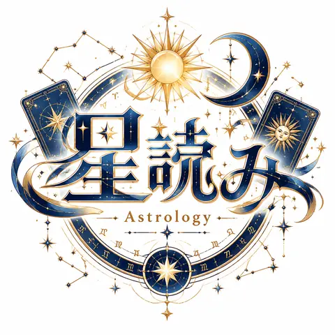
Celestial Zodiac Astrology Logo (Midnight Blue & Gold)1:1Celestial Zodiac Astrology Logo (Midnight Blue & Gold)@midori_tatsuta
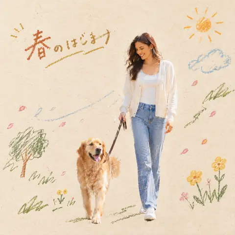
Photo + Crayon Doodle Editorial Poster (Japanese Prompt)Reference1:1Photo + Crayon Doodle Editorial Poster (Japanese Prompt)@konmari_tweet
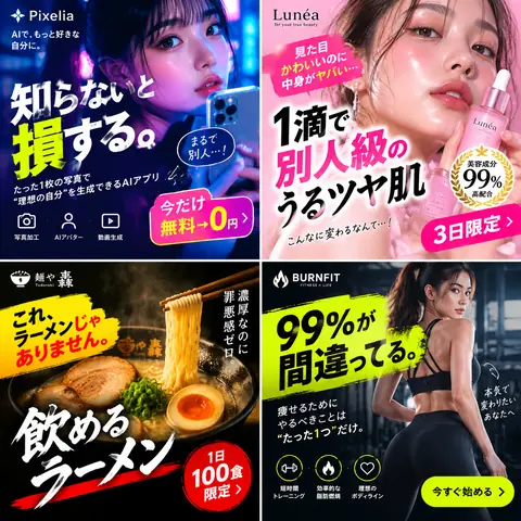
Viral Japanese Fake Ads 2x2 Grid (Japanese Prompt)1:1Viral Japanese Fake Ads 2x2 Grid (Japanese Prompt)@akiramenaiwoman
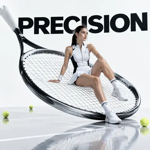
Giant Tennis Racket Sports Fashion Ad Prompt1:1Giant Tennis Racket Sports Fashion Ad Prompt@aronhouyu
Silhouette Epic Story Poster (Chinese Prompt)1:1Silhouette Epic Story Poster (Chinese Prompt)@liyue_ai
Logo Revealed Through Torn Street PostersReference4:5Logo Revealed Through Torn Street Posters@Goodmanprotocol
Minimal Product Shot with a White Doodle Character1:1Minimal Product Shot with a White Doodle Character@Sheldon056
Cozy Flat Lay with Hand-Drawn Doodle Labels1:1Cozy Flat Lay with Hand-Drawn Doodle Labels@Sairah_0
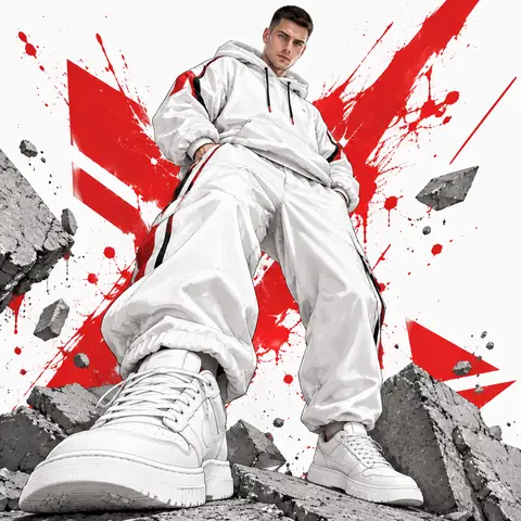
Low-Angle Urban Streetwear Illustration from Your PhotoReference1:1Low-Angle Urban Streetwear Illustration from Your Photo@Goodmanprotocol
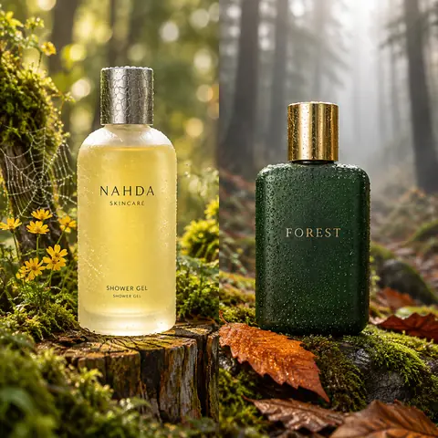
Forest Product Photography JSON Template (2 Bottles)1:1Forest Product Photography JSON Template (2 Bottles)@meng_dagg695
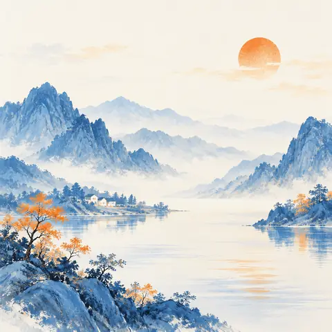
Blue & Orange Mountain Landscape Painting (Chinese Prompt)1:1Blue & Orange Mountain Landscape Painting (Chinese Prompt)@ZaynHao
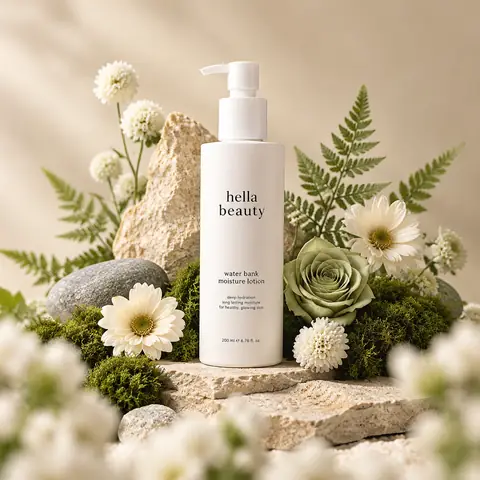
Botanical Skincare Pump Bottle Product Shot1:1Botanical Skincare Pump Bottle Product Shot@ChillaiKalan__
← PreviousPhoto + Crayon Doodle Editorial Poster (Japanese Prompt)Next →Celestial Zodiac Astrology Logo (Midnight Blue & Gold)
Cinel AI

Cinel AI is a free, unlimited AI text-to-image generator with prompt-based editing and AI image-to-video tools. Create images without signing up, edit with GPT Image 2, Seedream 5 Pro, and Nano Banana 2, then turn still frames into video with Seedance 2.5, Veo 3.1, and Kling 3.0.

ProductsFree AI Image GeneratorAI Video GeneratorImage TemplatesWorkspaceText to Image GeneratorImage to ImageText to Video GeneratorImage to VideoAI Image EditorBackground Remover
PromptsAll promptsPortrait & HeadshotProduct & E-commercePosters, Logos & Graphic DesignInfographics & UI3D Characters & FigurinesFood & DrinkIllustration & AnimeCreative ScenesGPT Image 2.5 promptsSources and takedown

AI Image Models

KolorsZ-Image TurboSeedream 4.0Seedream 4.5Seedream 5.0 LiteSeedream 5 ProGPT Image 2GPT Image 2.5Nano Banana 2 LiteNano Banana 2Nano Banana ProNano Banana

AI Video Models

Seedance 1.0 TurboSeedance 2.5Seedance 2.0 MiniSeedance 2.0MiniMax H3Kling 3.0Kling 3.0 TurboKling O1Kling O3Grok Imagine Video 1.0Grok Imagine Video 1.5Wan 2.5Wan 2.6Wan 2.7Veo 3.1 FastVeo 3.1 ProVeo 3.1 Fast BetaVeo 3.1 Pro BetaSora 2
CompanyPricingAboutContactsupport@cinel.aiPrivacyTermsAcceptable Use
© 2026 Cinel AI. All rights reserved.